服务热线:
 18764138233
18764138233
 18764138233
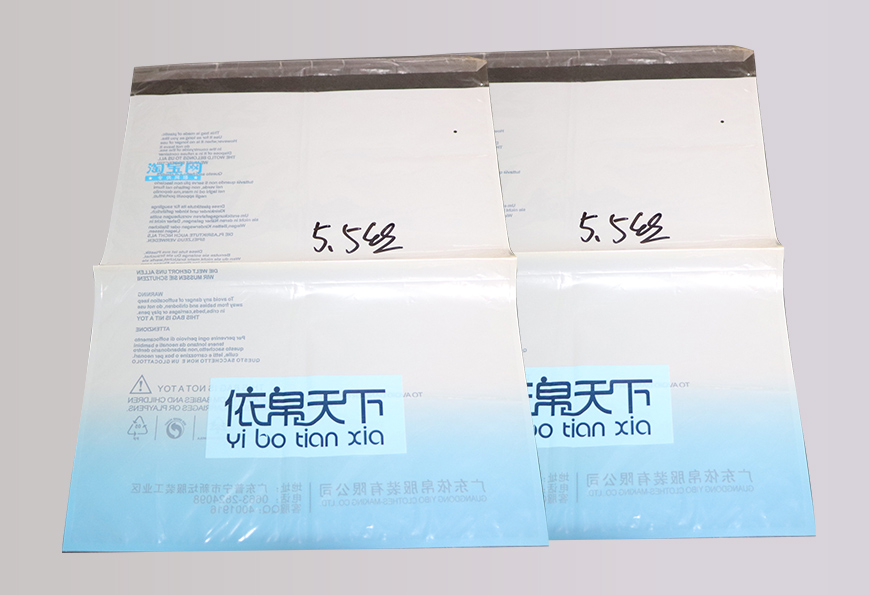
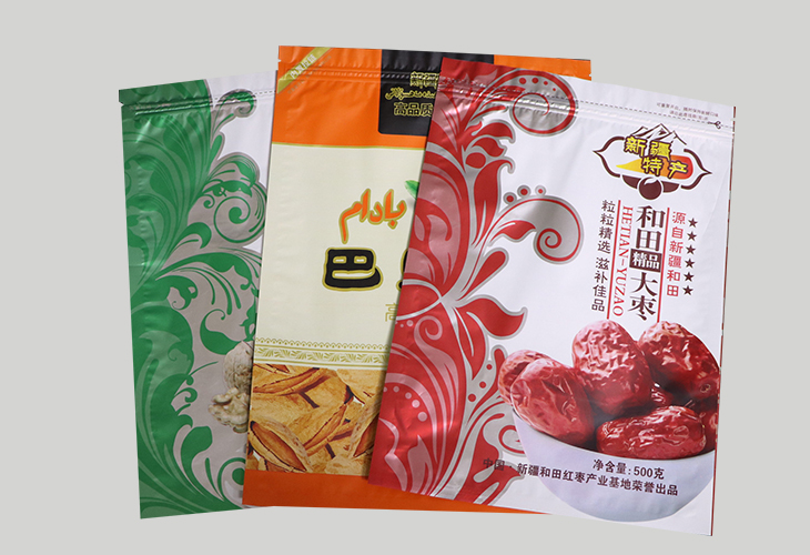
在消费升级的浪潮中,农产品包装已不再是简单的“容器”,而是连接产品与消费者的“语言”。一场以“精致设计”为核心的视觉革命正在悄然发生——它用色彩讲故事、用材质传温度、用细节塑价值,让土特产褪去“乡土气”,化身兼具美感与文化内涵的“新国潮”。
In the wave of consumer upgrading, agricultural product brand packaging is no longer just a simple "container", but a "first language" that connects products with consumers. A visual revolution with "exquisite design" as the core is quietly taking place - it tells stories with color, conveys temperature with materials, and molds value with details, so that local products can lose their "local flavor" and become the "new China-Chic" with aesthetic feeling and cultural connotation.
层进化:色彩的“自然叙事”
The first layer of evolution: the "natural narrative" of color
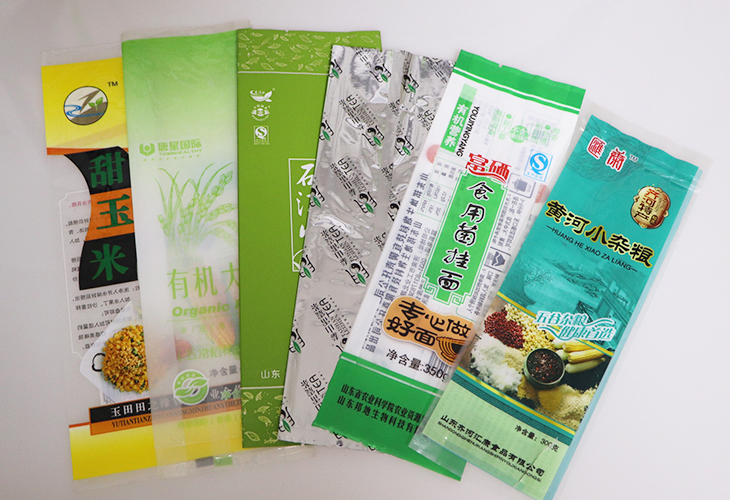
农产品包装的色彩革命,始于对“自然色”的深度解构。设计师不再满足于简单的“绿色=有机”“土黄=天然”,而是将色彩与产地、季节、品种深度绑定。例如,用赭石红表现红枣的糖分沉淀,以雾蓝渲染深海鱼类的冷冽质感,借橄榄绿传递橄榄油的浓郁果香。这种“色彩地理学”,让包装成为产品的“视觉说明书”。
The color revolution of agricultural product packaging began with a deep deconstruction of "natural colors". Designers are no longer satisfied with simple "green=organic" and "earthy yellow=natural", but deeply bind colors with origin, season, and variety. For example, using ochre red to depict the sugar precipitation of red dates, using fog blue to render the cold texture of deep-sea fish, and using olive green to convey the rich fruit aroma of olive oil. This' color geography 'makes packaging a' visual instruction manual 'for products.
更前沿的尝试是“动态色彩”。通过温变油墨或光感涂料,包装色彩能随环境变化产生微妙改变——冷藏时呈现冰晶蓝,室温下渐变为麦穗金。这种“会呼吸的色彩”,为消费者创造了独特的互动体验。
A more cutting-edge attempt is "dynamic color". By using temperature sensitive ink or light-sensitive coatings, the packaging color can undergo subtle changes with the environment - appearing ice crystal blue when refrigerated and gradually transitioning to wheat ear gold at room temperature. This' breathing color 'creates a unique interactive experience for consumers.
第二层进化:图形的“文化解码”
Second layer evolution: "cultural decoding" of graphics
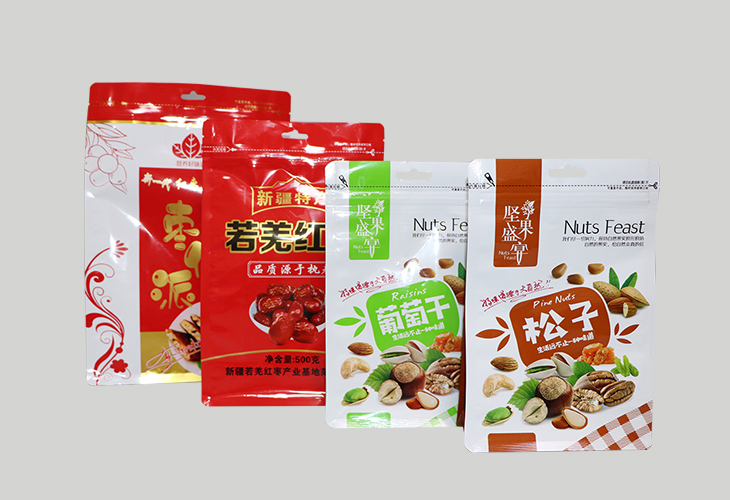
农产品包装的图形设计,正从“具象描摹”转向“抽象表达”。设计师不再直接复现农作物的形态,而是提取其文化符号进行艺术重构。例如,将茶叶的嫩芽转化为水墨笔触,把稻谷的颗粒解构为几何图腾,用剪纸艺术演绎畜牧业的轮廓。这种“图形转译”,既保留了产地特色,又赋予包装现代美学价值。
The graphic design of agricultural product packaging is shifting from "concrete depiction" to "abstract expression". Designers no longer directly reproduce the form of crops, but extract their cultural symbols for artistic reconstruction. For example, turning tea shoots into ink strokes, deconstructing rice grains into geometric totems, and interpreting the outline of animal husbandry with Paper Cuttings art. This' graphic translation 'not only preserves the characteristics of the place of origin, but also endows the packaging with modern aesthetic value.

更值得关注的是“非遗活化”。将扎染、蜡染、榫卯等传统工艺融入包装结构,使开箱过程成为“文化解谜游戏”。这种设计不仅提升了包装的仪式感,更让传统技艺在当代语境中重生。
More noteworthy is the revitalization of intangible cultural heritage. Integrating traditional crafts such as tie dye, wax dye, mortise and tenon into packaging structures, making the unboxing process a 'cultural puzzle game'. This design not only enhances the sense of ceremony in packaging, but also revitalizes traditional skills in contemporary contexts.
第三层进化:材质的“触觉革命”
The third layer of evolution: the "tactile revolution" of materials
农产品包装的材质选择,正在突破“纸与塑料”的二元框架。再生纸浆模塑、麻布复合材料、竹纤维编织等材质,既降低了碳排放,又创造了独特的触感体验。例如,鸡蛋托盘采用蜂窝状纸浆结构,既防震又透气;菌菇包装选用透气性亚麻布,延长保鲜期的同时传递自然质感。
The material selection for agricultural product packaging is breaking through the binary framework of "paper and plastic". Recycled pulp molding, burlap composite materials, bamboo fiber weaving and other environmentally friendly materials not only reduce carbon emissions, but also create a unique tactile experience. For example, the egg tray adopts a honeycomb shaped pulp structure, which is both shockproof and breathable; The mushroom packaging is made of breathable linen cloth, which not only extends the shelf life but also conveys a natural texture.
更创新的是“可食用包装”。以海藻酸钠制成的薄膜包裹坚果,用糯米纸印制产品信息,这些设计将包装本身转化为产品的一部分,实现了“零废弃”理念。
Even more innovative is the 'edible packaging'. Wrapping nuts in a film made of sodium alginate and printing product information on glutinous rice paper, these designs transform the packaging itself into a part of the product, achieving the concept of "zero waste".
第四层进化:结构的“功能美学”
The fourth level of evolution: the "functional aesthetics" of structure
农产品包装的结构设计,正从“保护商品”向“优化体验”进化。可重复封口的拉链式米袋、自带刻度线的调味料瓶、模块化组合的果蔬礼盒……这些设计不仅提升了使用便利性,更通过结构创新传递温度。例如,蜂蜜包装采用“挤压+倾倒”双模式瓶口,满足不同场景需求;茶叶罐内置湿度计,实时显示存储环境。
The structural design of agricultural product packaging is evolving from "protecting goods" to "optimizing experience". The design of reusable zipper style rice bags, seasoning bottles with built-in scale lines, and modular combination fruit and vegetable gift boxes not only enhances user convenience, but also conveys brand temperature through structural innovation. For example, honey packaging adopts a dual-mode bottle mouth of "squeezing+pouring" to meet the needs of different scenarios; The tea can is equipped with a built-in hygrometer that displays the storage environment in real-time.
更的探索是“扁平化设计”。通过折叠结构将包装体积压缩70%,既降低运输成本,又减少仓储空间。这种“结构减法”,体现了对资源的利用。
The ultimate exploration is' flat design '. By folding the structure, the packaging volume is compressed by 70%, which not only reduces transportation costs but also reduces storage space. This' structural subtraction 'reflects the efficient utilization of resources.
第五层进化:信息的“视觉降噪”
The fifth layer of evolution: "visual denoising" of information
在信息过载的时代,农产品包装的“视觉降噪”成为新趋势。设计师通过极简布局、留白艺术和符号化表达,让关键信息一目了然。例如,用色块区分产品等级,以图标替代文字说明,借材质差异暗示品类属性。这种“少即是多”的设计哲学,既符合现代审美,又提升了信息传达效率。
In the era of information overload, the "visual noise reduction" of agricultural product packaging has become a new trend. Designers use minimalist layout, white space art, and symbolic expression to make key information clear at a glance. For example, using color blocks to distinguish product grades, replacing text descriptions with icons, and implying category attributes through material differences. This design philosophy of 'less is more' not only conforms to modern aesthetics, but also enhances the efficiency of information communication.
更巧妙的是“隐藏式设计”。将溯源二维码融入农作物生长周期图,把营养标签设计成土壤剖面图,这些细节让包装成为“可阅读的百科全书”。
Even more clever is the 'hidden design'. Integrating traceability QR codes into crop growth cycle maps and designing nutrition labels as soil profile maps, these details make the packaging a 'readable encyclopedia'.
农产品包装的精致设计,本质是对产品价值与文化属性的深度挖掘。它要求设计师兼具艺术家的创造力与农人的敬畏心,在色彩、图形、材质、结构与信息之间构建起美感、功能与文化的平衡。当包装成为产品的“第二层皮肤”时,我们看到的,是农业从“原料供应”向“生活方式提案”的进化。这种进化,无关标签,而是对土地与消费者的双重尊重。
The exquisite design of agricultural product brand packaging is essentially a deep exploration of product value and cultural attributes. It requires designers to combine the creativity of artists with the awe of farmers, building a balance between beauty, functionality, and culture between color, graphics, materials, structure, and information. When packaging becomes the 'second skin' of a product, what we see is the evolution of agricultural brands from 'raw material supply' to 'lifestyle proposals'. This evolution is not about price tags, but about a dual respect for land and consumers.
本文由济南复合塑料袋友情奉献.更多有关的知识请点击:http://www.jingmeisuliao.com真诚的态度.为您提供为的服务.更多有关的知识我们将会陆续向大家奉献.敬请期待.
This article is a friendly contribution from Jinan Plastic Bag For more information, please click: http://www.jingmeisuliao.com Sincere attitude To provide you with comprehensive services We will gradually contribute more relevant knowledge to everyone Coming soon.

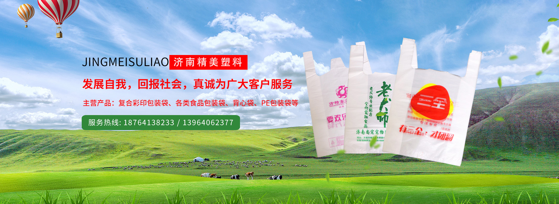
主营产品:复合彩印包装袋、各类食品包装袋、背心袋、PE包装袋等
 当前位置:
当前位置: